Color Psychology: The Language of Color and Emotion
Because of my profession, I usually say “color” rather than “shade.” It may sound like a small difference in wording, but to me color is never just a surface covering an object. It is a language and a way of understanding life itself.
Even as I sit here writing, I only need to look around to see this truth. The whiteness of the wall whispers calmness, the warm tones of the wooden table offer comfort, and the bold primary of the book covers speak their own loud stories.
Not a single day, not even a moment, passes without my mind being touched by color.
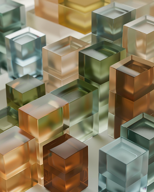
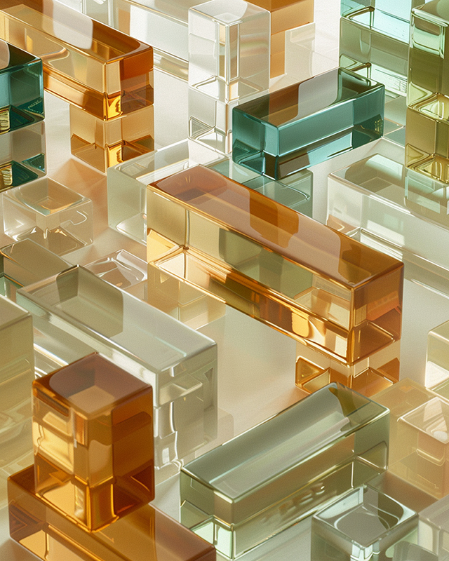
Muted plexiglass tones embody calmness and depth, mirroring moments of reflection and grounded stability.
Color Resembles People: A Designer’s Philosophy on Hue and Personality
I often compare color to people.
Within blue, there is warmth, coolness, and sometimes even sorrow. Colors that appear similar can leave entirely different impressions with the slightest tonal shift.
People are no different. Two individuals may seem alike in temperament, yet their tone of voice, gestures, and lived experiences shape them into utterly distinct beings. Even those who grow up in similar environments and work in the same field carry unique blends of thought and emotion—just as one red mixed with different hues creates entirely new colors.
Designing and completing a product often feels to me like raising a child.
Of course, my designs cannot speak or express emotions the way people do. Yet throughout the process, something like a distinct personality emerges within each piece.
Color sometimes becomes the starting point, other times it’s applied at the final stage. But color is always the most crucial element that ultimately determines the product’s character. When the same product receives different colors, entirely different personalities are born, and each finds its way to different people’s choices.
I hope that every color version will be loved for its own unique charm—just as a parent wishes for each child to live happily with their individual character.
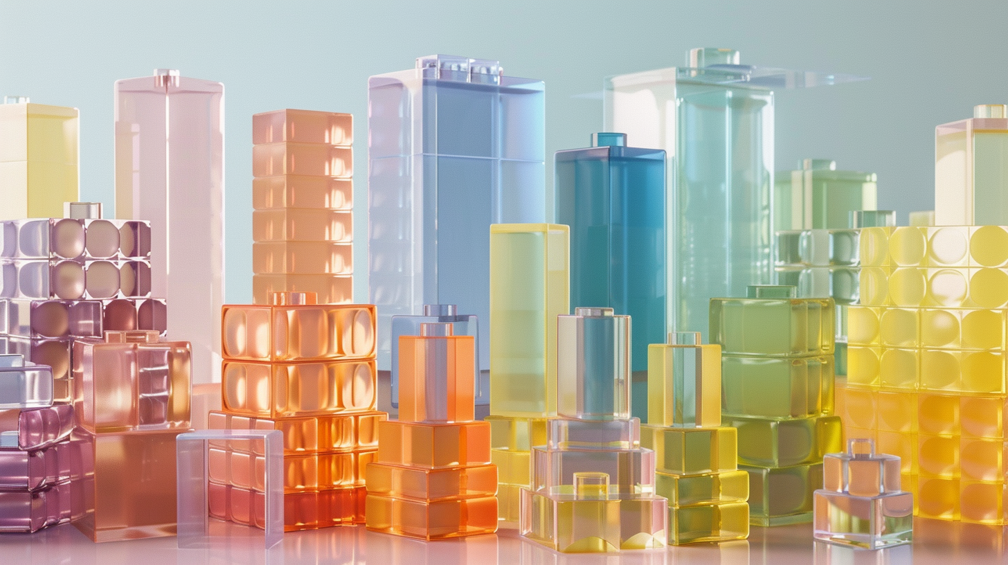
Plexiglass blocks, though identical in form, reveal completely different characters depending on the tones they carry. Pastels suggest gentle warmth and openness, vivid colors radiate energy and vitality, while muted shades convey calmness and depth. Just as people may live within the same environment yet grow into unique individuals shaped by their character and experiences, color becomes a language through which we can understand life and share empathy.
Reading the Language of Color: How Shades Express Human Emotion
How much do we express through color in our everyday lives?
Quite naturally, we describe emotions through shades. The same red can be passionate one moment and angry the next. Blue may calm and soothe, or sink into sorrow. Yellow often suggests light and optimism, yet it can also betray unease and restlessness.
The fact that a single hue can convey emotions so opposite makes color more than a visual property—it becomes one of the most fascinating languages of the heart.
Of course, not everyone reads this language with the same sensitivity. Some see only the surface, while others can grasp the subtle nuances hidden within. This difference in perception is much like empathy itself—the ability to sense how deeply we can understand another person’s feelings.
In my work, I feel this constantly. Just as life sometimes demands moments of exuberance, design sometimes calls for vibrant, energetic colors. And just as there are quiet days of gratitude, there are projects that ask for understated, refined neutrals. Each choice becomes not only a reflection of my own state of mind, but also a way of showing others who I am in that moment.
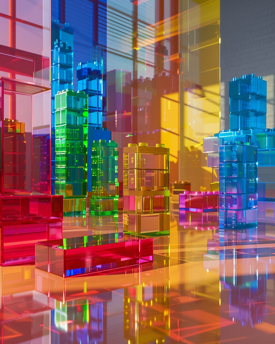
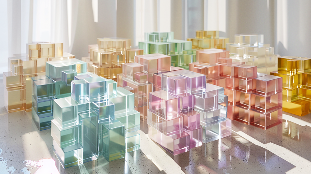
Vivid plexiglass forms radiate energy and vibrancy, symbolizing creativity, new beginnings, and bold expression.
The True Power of Color and Empathy
This, I believe, is the true power of color.
When we notice the colors someone chooses, we begin to read the message they wish to send. Neutral tones can project chic sophistication, while bright shades might radiate joy and vitality. Yet meanings are never fixed—sometimes they conceal opposite truths.
What matters is not the color itself, but the intention behind it. Color can be more honest than words, but it requires careful attention to interpret.
When we accept and appreciate the different colors of others, something new emerges—like unexpected blends on a palette. In this way, color becomes one of the most natural bridges of empathy.
My Color, Our Color: The Bridge to Universal Empathy
So what is the color of your day?
It may be a bright yellow, a calm blue, or a complicated mix too subtle to name. What matters is not whether it is right or wrong, but simply that it is yours.
I continue to spend most of my days surrounded by color. Through it, I try to see the world, other people, and myself more deeply. For color is not only what the eyes perceive—it is a language the heart can read.
And when we learn to honor each other’s colors, we create a new shade together: the color of empathy.
Lightly, yet deeply. And above all, colorfully.
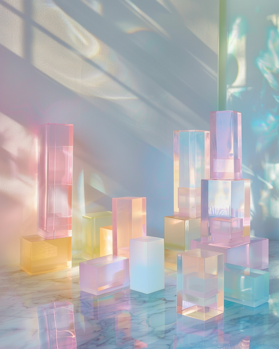
Plexiglass in pastel hues conveys softness and openness, echoing subtle emotions and quiet warmth.